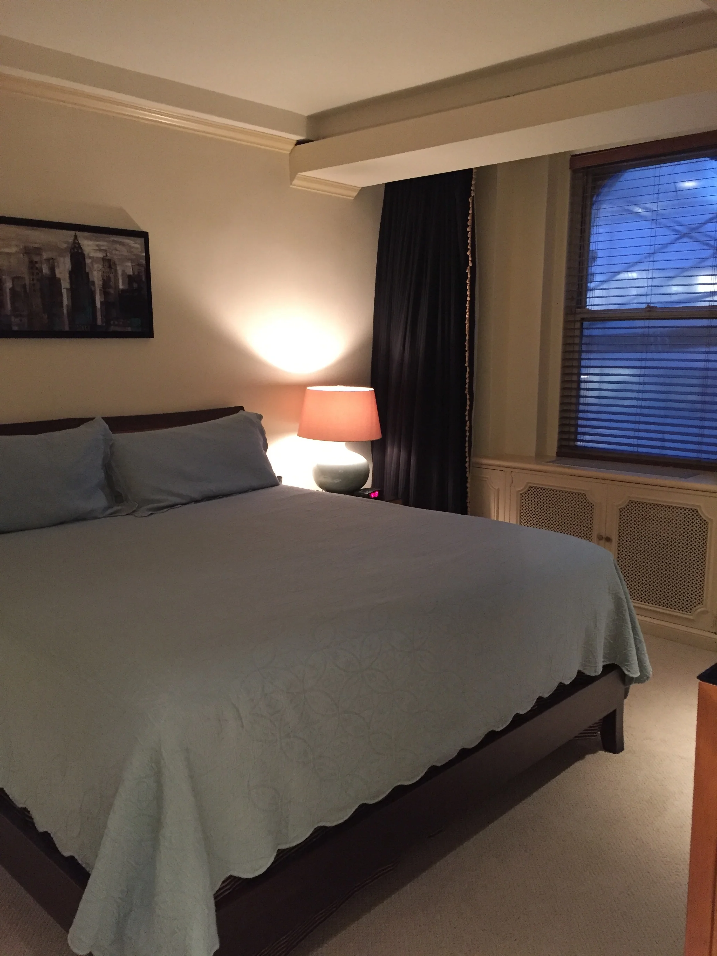
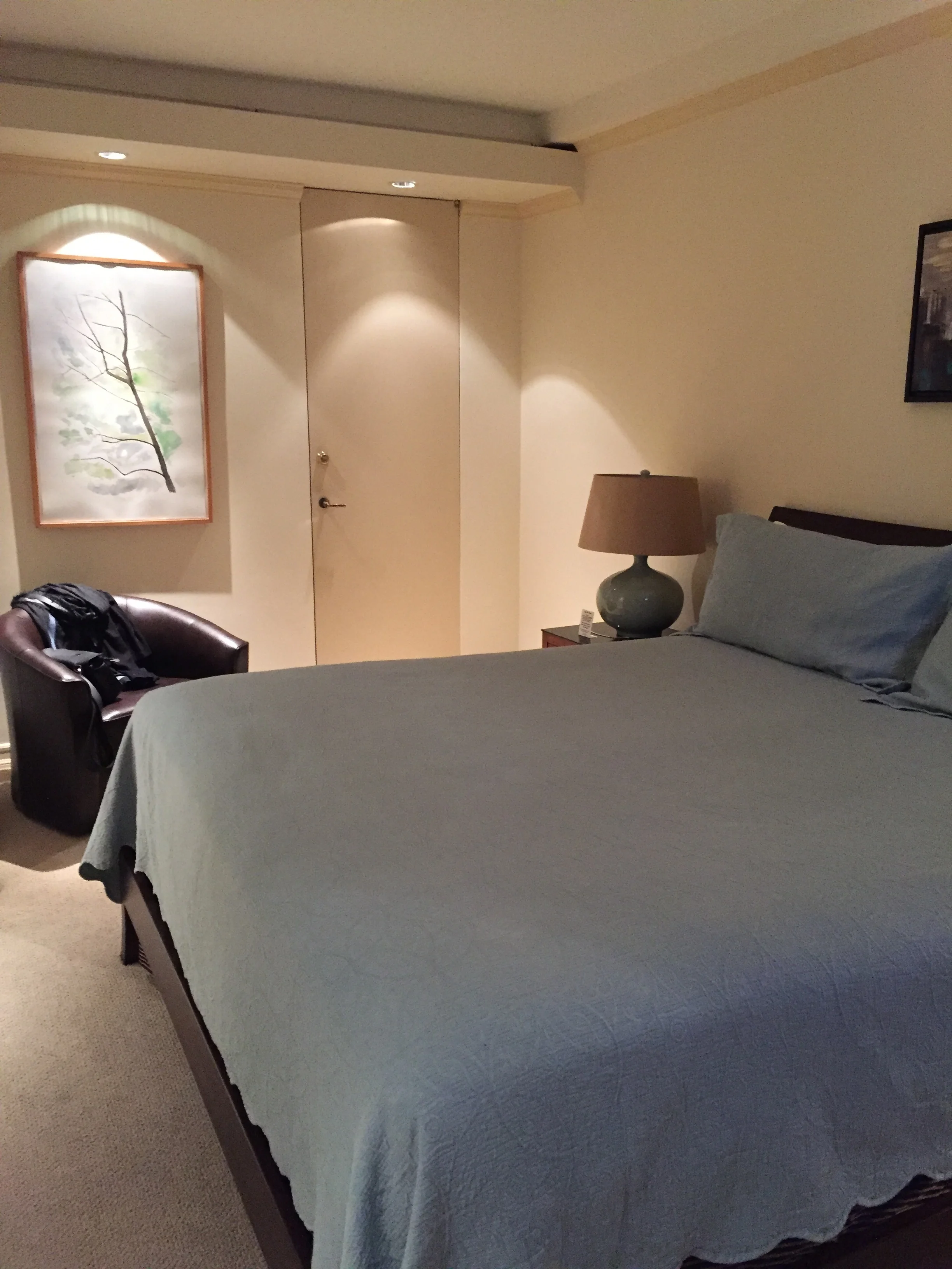
Before and After Lombardy hotel interventions
THE HOME AWAY FROM HOME DESIGN PROJECT
The noted Marie Burgos Hospitality Design Studio was recently asked for a second time to create new, updated decor for two guest suites at Manhattan's renowned Lombardy Hotel. Each suite includes a living room, a master bedroom and an en-suite kitchen and master bath.
Suite #1: Studio with mini bar and en suite bathroom
The clients are based in Europe and come to New York several times a year for business and pleasure. They wanted bright, open contemporary spaces that they really could call their home away from home. They also wanted comfortable, sophisticated suites that other Lombardy guests staying there when they are away would find equally pleasurable.
Throughout a distinctive Feng Shui approach was used by deftly layering five essential natural elements -- wood, earth, metal, fire, and water.
BEFORE
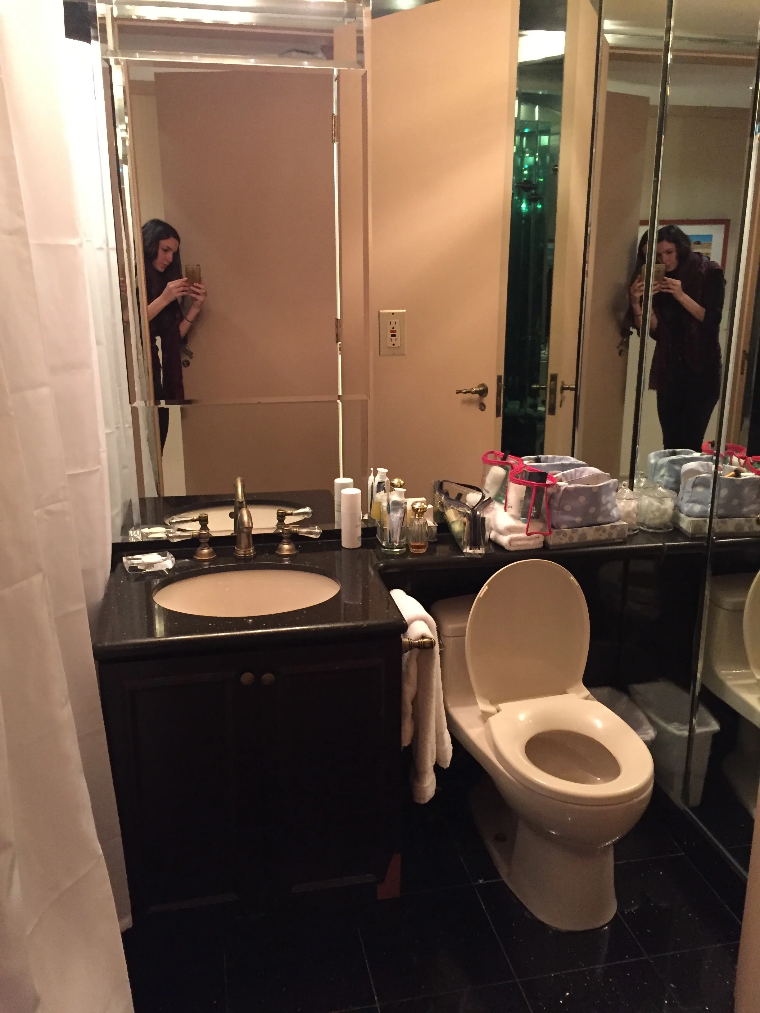
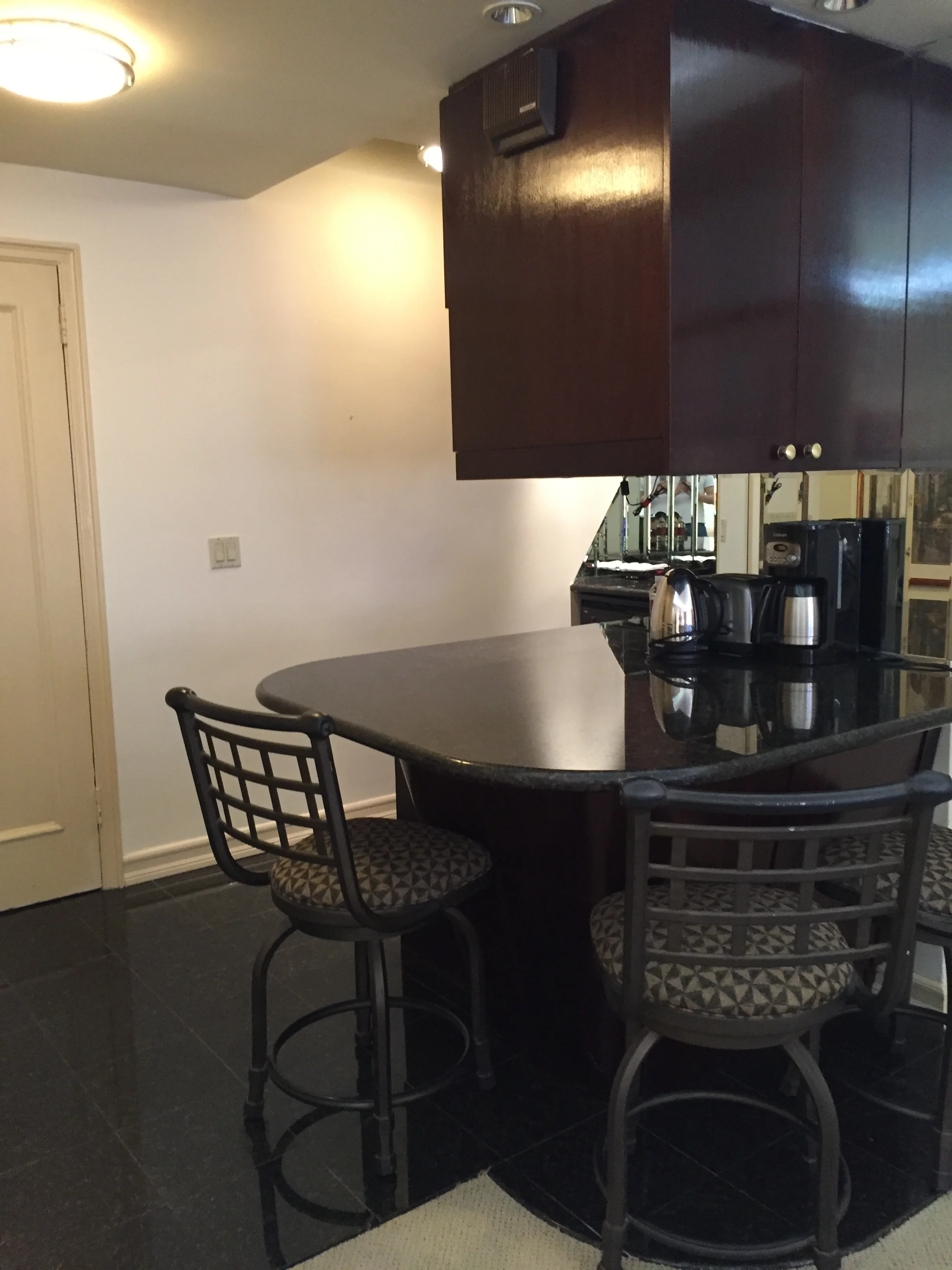
At first Burgos and her team were confronted with two suites with dated 80s styling ......old frayed carpeting, unflattering shades of beige throughout, and worn furnishings that reflected the style of a much earlier era.
Living room- open kitchen
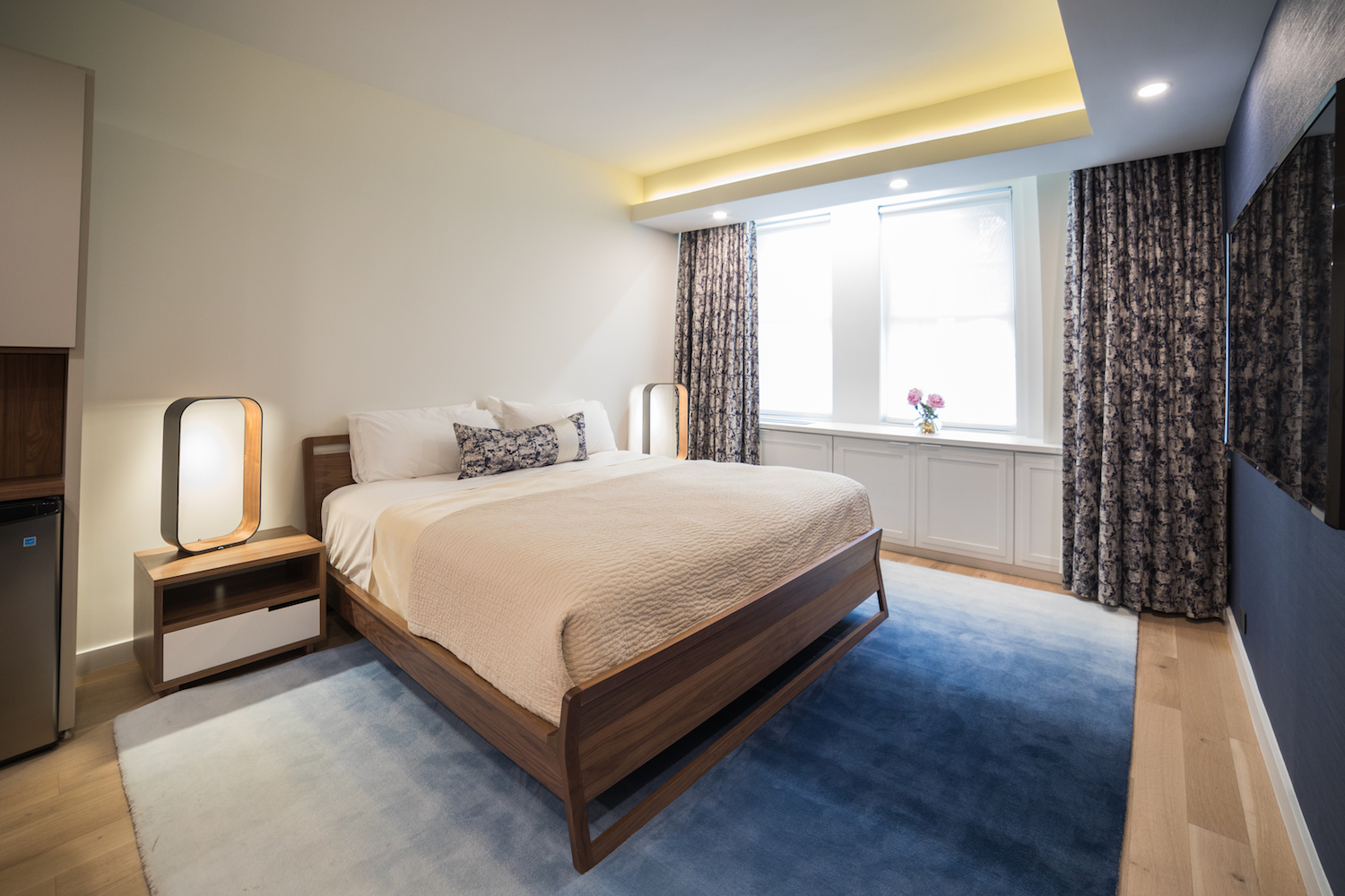
Serene color pallets in subtle shades of gray and blue were carefully selected to create an atmosphere of ultimate comfort. This provides a soothing backdrop for the precisely considered balance of curves and straight lines, hard surfaces and straight ones found in the furnishings of each of the rooms. The atmosphere is further enhanced by different types of lighting that can be subtely modified to vary the mood of any of the rooms.
We replaced tired carpeting by a warm oak wood flooring throughout the whole space to create a cohesive decor and make the space feel larger. This was also a very durable and clean solution.
BEFORE
The kitchens and baths were also given much-needed make-overs. Dark, heavy cabinets were removed -- in some cases they blocked the view into the other rooms and access to natural light. They were replaced with modern, clean line white cabinetry along with the addition of modern fixtures and appliances.
Suite #2:
BEFORE
By Anais Gibaud
