Before and After Pictures of the Spicy Warehouse Project Designed by Feng Shui Master Marie Burgos
Spice Warehouse -Tribeca New York City
“The style of this design was guided by its history. Established in 1895 as a warehouse for the spice trade, this building had a character that no other building had and it was important to keep this feel.
It was very important to keep the authenticity of the building and keep its history alive with the right design ellements for the client. Tribeca is a very trendy neighborhood where designers tend to go very modern or plain industrial which I previously did in other designs. But the clients wanted their property to be different from all the other properties around in the sense that this space had been a Spice House and it had to be reflected in the design.”
Before - Living Room
“The iron columns were revived to their former glory and the layers of paint were removed from the beam to explore the beauty of the original oak.”
“This living room design reflects a tailored “old world” look, respecting the original features of the Spice Warehouse.
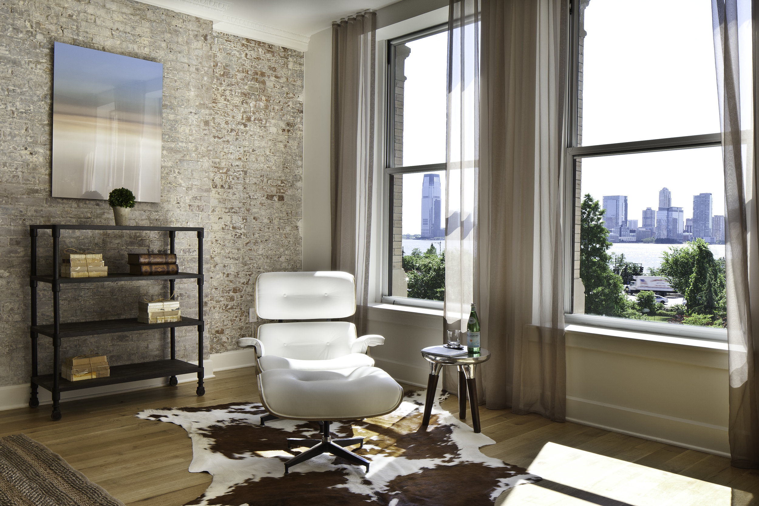
I wanted the original brick wall to be revealed so this space could be a testament of ancient time and old world elegant.”
Before- Living Room
Previous Columns - brick wall - Beam
“The layout is open and flowing to keep the feel of grandeur of the space so each piece and design finish can be admired individually.
Feng Shui was used to create balance and harmony in a very monochromatic space. The fact that I used light colors as the Benjamin Moore Decorators white walls, white cabinets, natural oak floors throughout the whole space and even whiten the original brick wall in the living room, promotes caliming energy into the room.
I also focused on creating a free of clutter, open floor plan to ensure proper circulation o Chi energy. The Chi needs to move freely into your home to nourish every area of your home to benefit you. If the current of energy meets blockages such as clutter, too much furniture of a bad layout,the chi flow will be impeded, creating a detrimental effect for people living in this home.”
Via Worsleyinstitute.com
“The Chinese believes that we are surrounded by 5 natural elements. Those are water, wood, fire, earth and metal.
All those elements have to be present in your environment to create balance and harmony. They can be represented by a color, a shape or the element itself.”
“It was important to introduce the Five natural elements. Feng Shui is based on nature. The original buddhist monks who created the amazing philosophy of Feng Shui did a study of environment, spaces and nature and their impact on people.
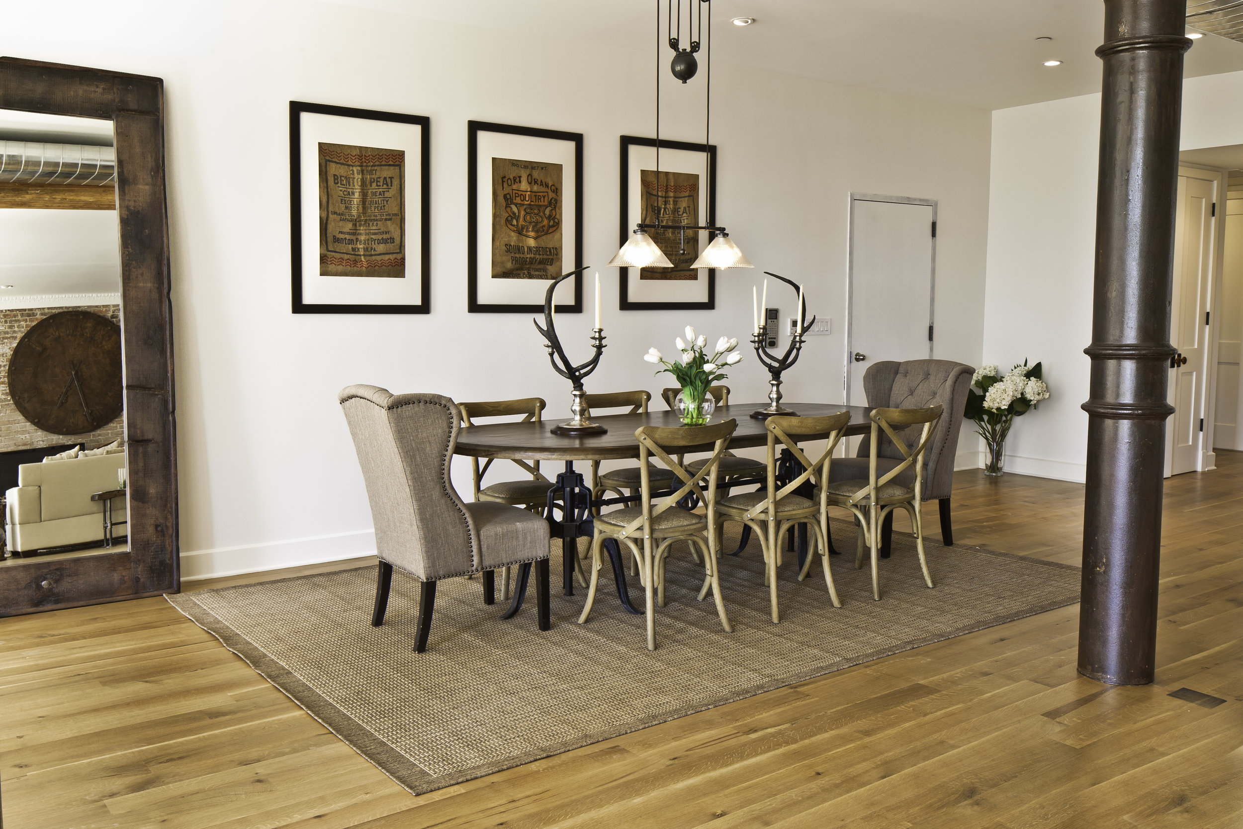
A fundamental part of Feng Shui is also the balancing of the opposing forces of Yin & Yang. Yin is female, dark and passive, while Yang is male, bright and active. Similarly, each quality has an opposite such as hard and soft, angular and wavy, dark and light, wet and dry, cool and warm… For example, in the living room, I made sure to balance hard yang items such as hardwood coffee tables, mirrors, and glass, brick wall, with soft yin pillows, flowy curtains, plush pillows, and rugs. If you have too many yin or yang accessories, there will be an energy imbalance. Here the space is nicely balanced with all the difeferent textures used.
When applying Feng Shui to your home, you are actually bringing in the forces of nature and integrating that nature in your space as a support for your life.”
“Here are some examples of elements I used to balance the Feng Shui of the living room space:
-Wood (wooden floor, wooden tables, woodend chairs...),
-Water (mirror, glass table top, acrylic artwork of wavy shapes...),
-Metal ( white walls, white leather lounge chaise, iron clock, metal horse head, iron columns...),
-Fire (cowhide shapes, candelabra/ candles, red jars...)
-Earth (brick wall, caesarstone countertop,...)”
Project parameters/challenges/inspirations:
“It was very fulfilling for me to research and find unique furniture and accents pieces with an “old world” feel. They had to be unique like the Indonesian coffee table, antique like the giant iron clock and/ or unexpected like the metal horse head. Also, I made a point of finding pieces that were in exceptional material such as an oversized mirror handcrafted from vintage wood planks salvaged from boats, a double crank dining table featuring an industrial aesthetic with a unique blend of iron and distressed mango wood, comfortable host and hostess dining chairs in a tan linen, solid oak chair with Cain seat which combine the rustic charm of an old French Farmhouse with an industrial look.”
“I have also balanced modern pieces such as the Eames lounge chaise or the Shell chairs or even the Ibiza white leather chairs for comfort with more rustic pieces. This defines an elegant look and also brings in warmth and makes this space a unique haven in the middle of Manhattan.
It was incrdibly satisfying to see the space completed and the client happy that their vision had been fulfiled.
I love the authenticity of the building, the history which can be seen in the iron columns, the brick wall and the 13 feet ceiling height...
I love that I used very few pieces of furniture and accents but that they are all unique, carry history or an old world/ industrial character so this design really respect the character of the building. ”
Photographer’s name: FRANCIS AUGUSTINE


