4 POP UP INSTALLATIONS THAT WILL BLOW YOUR MIND!
Each year the Interior Design Best Of Year Award honors the most significant work of the year and most recognized designers, architects and manufacturers from around the globe.
This year, we have subscribed the Le Tray Coffee Table for the Furniture Category, and we are very grateful for all of the support that we have received from all of you!
As they have recently closed their subscriptions for 2017, we were very curious to see the winners of the best Architectural Pop Up Installation from last year!
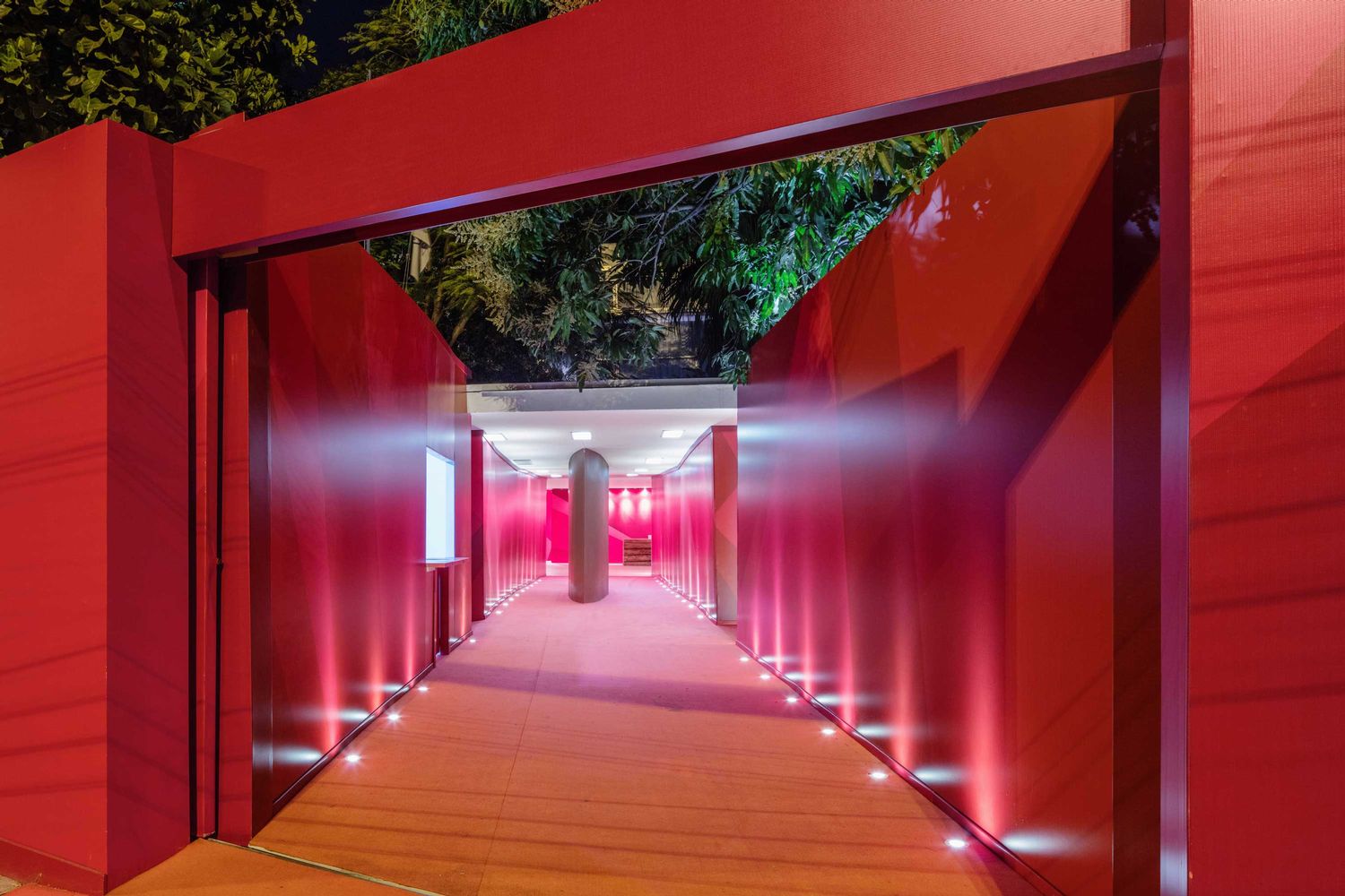
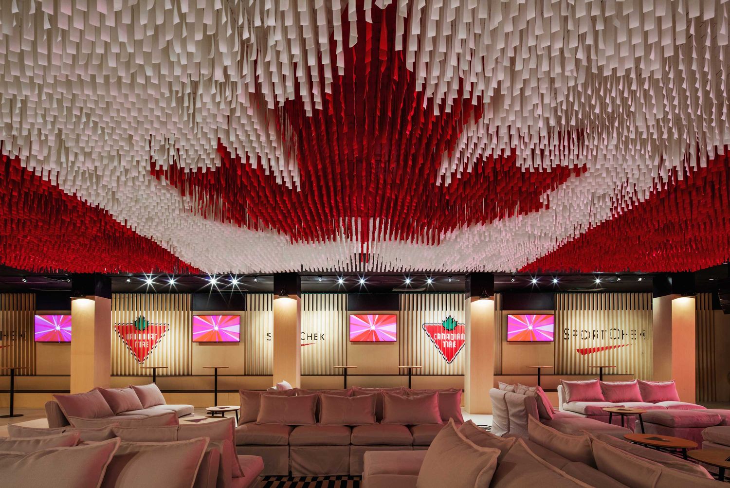
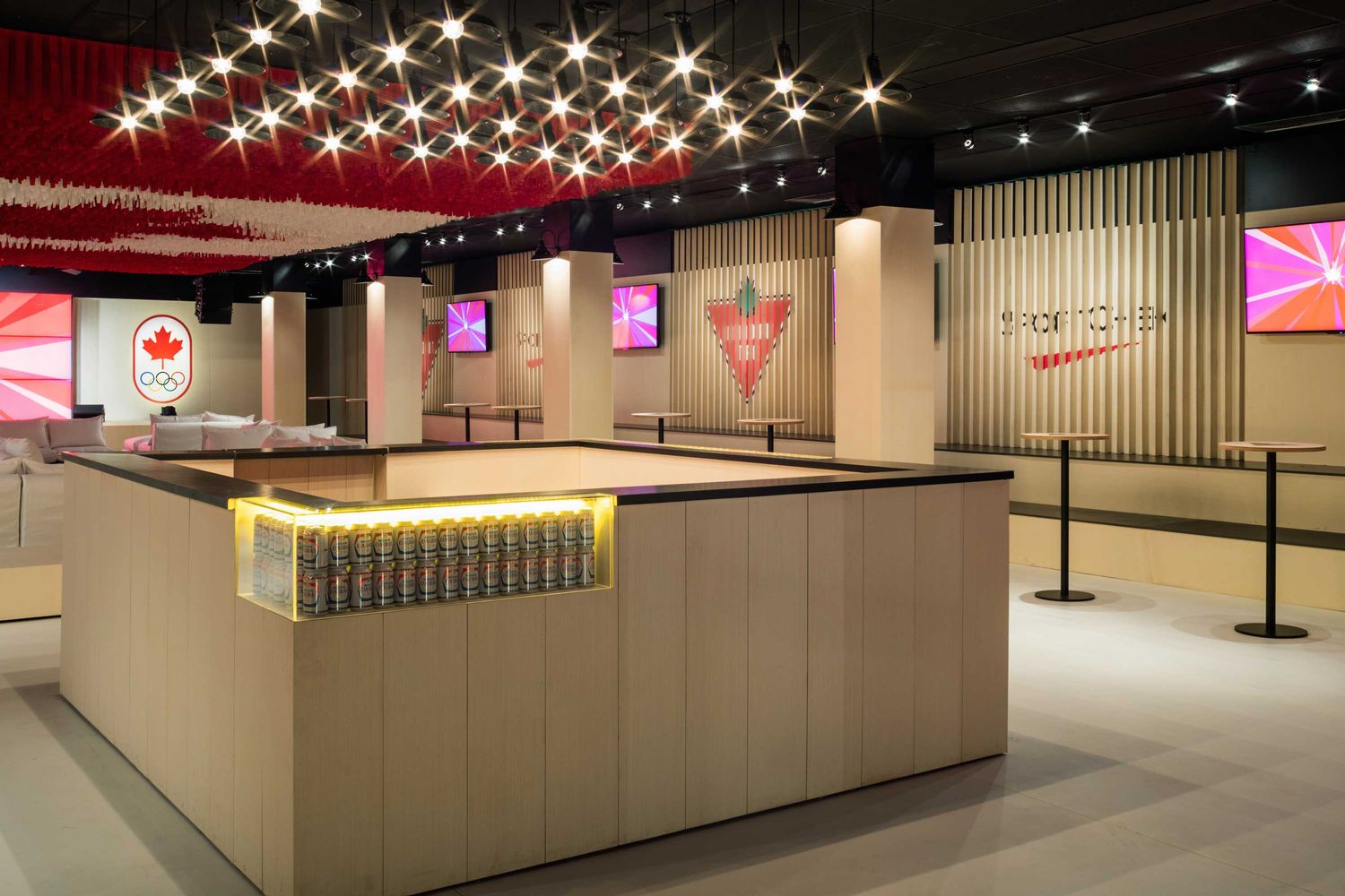
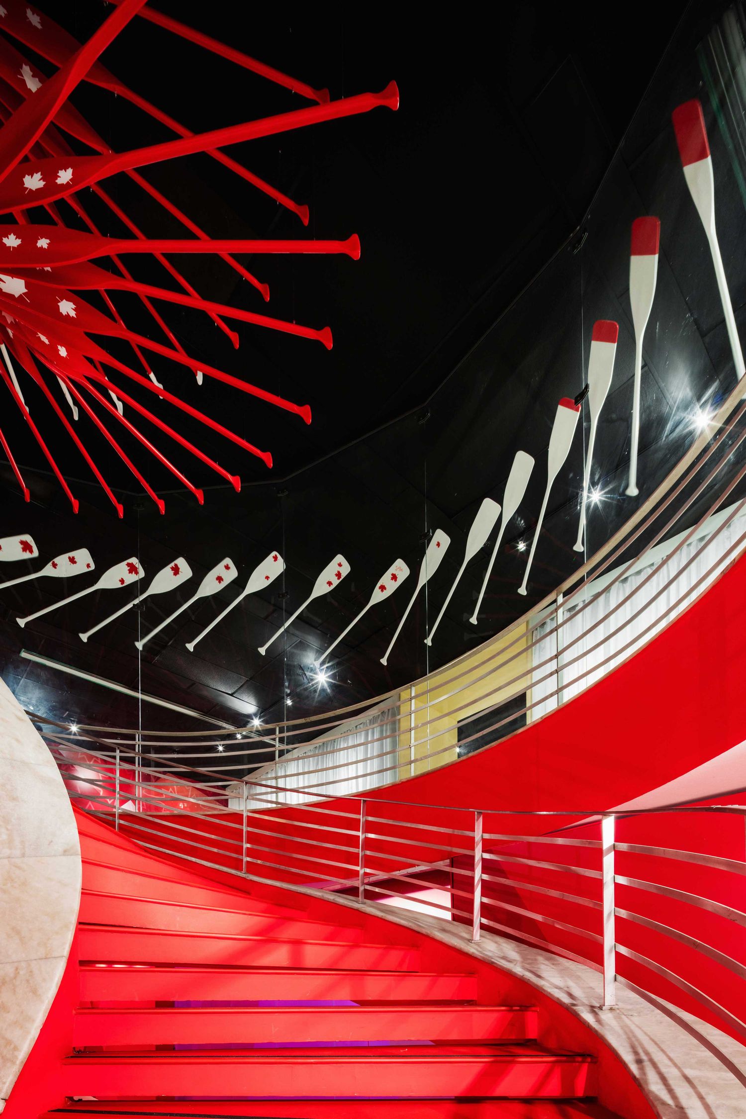
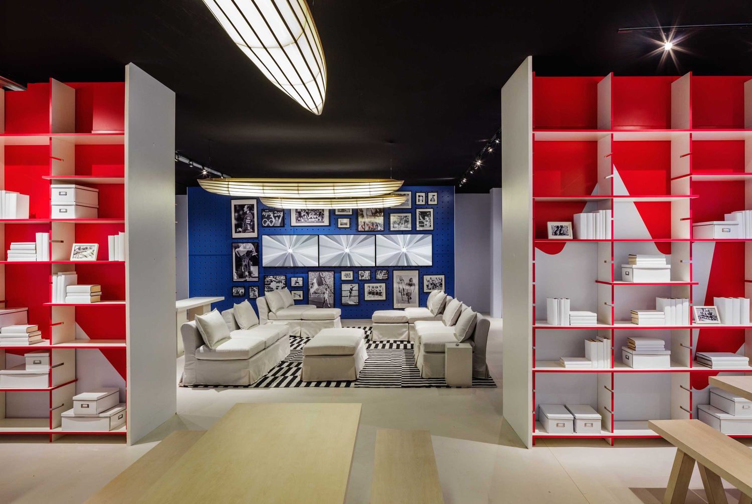
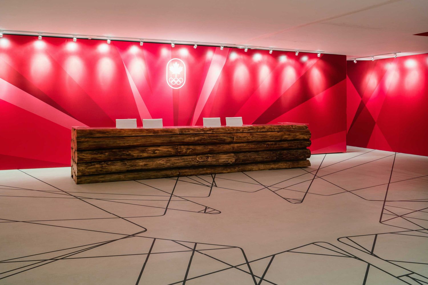
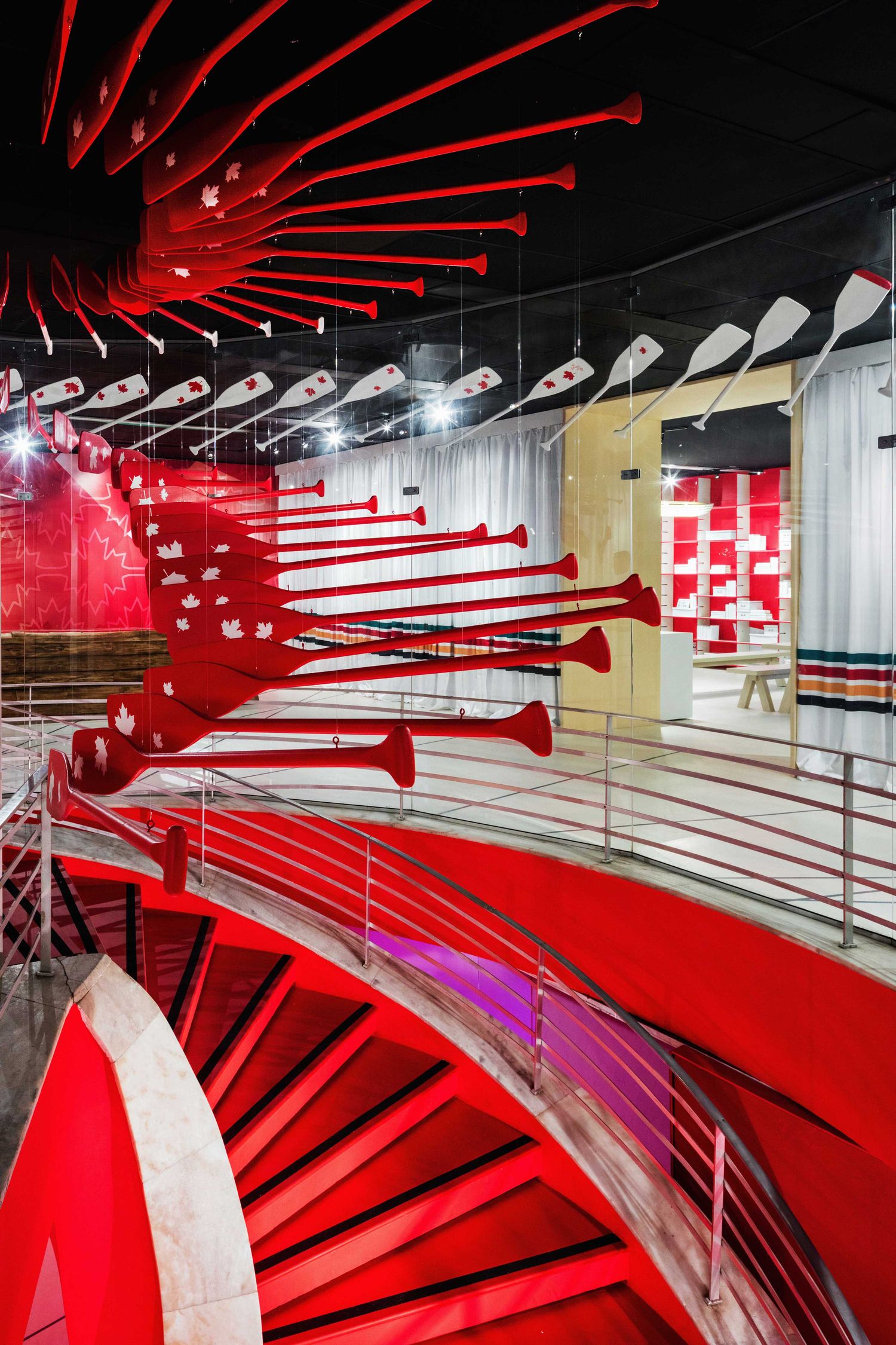
Canada Olympic House by Yabu Pushelberg
Photo credit www.azuremagazine.com
The entire interior had to be installed within a timeframe of under two weeks. Although it was well outside their usual realm, and bound to an “extremely constrained budget,” it presented a chance to show that creativity doesn’t depend on dollars. “The Canada Olympic House celebrates the transformation of simple, readily available objects and materials to express a verve and vitality unique to this time and place,” the duo says. “We wanted to surprise people.”
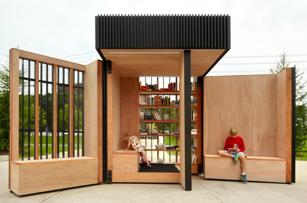
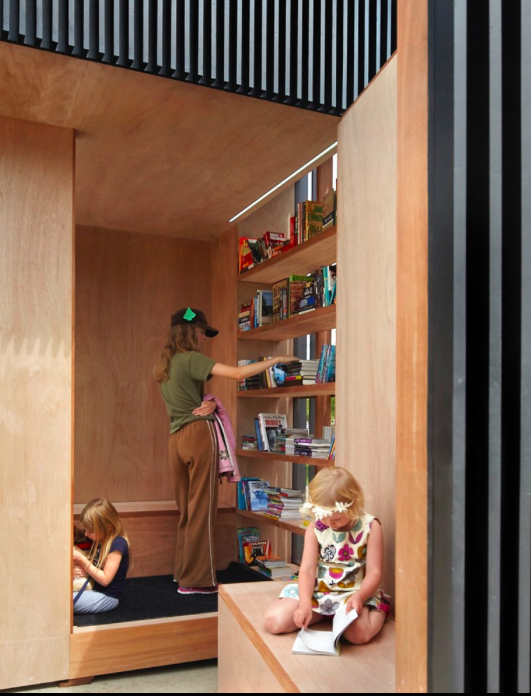
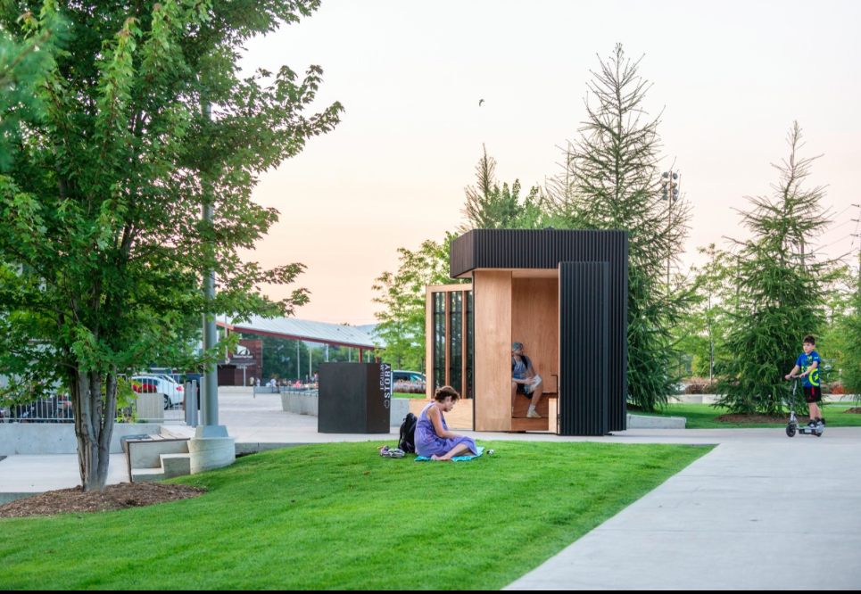
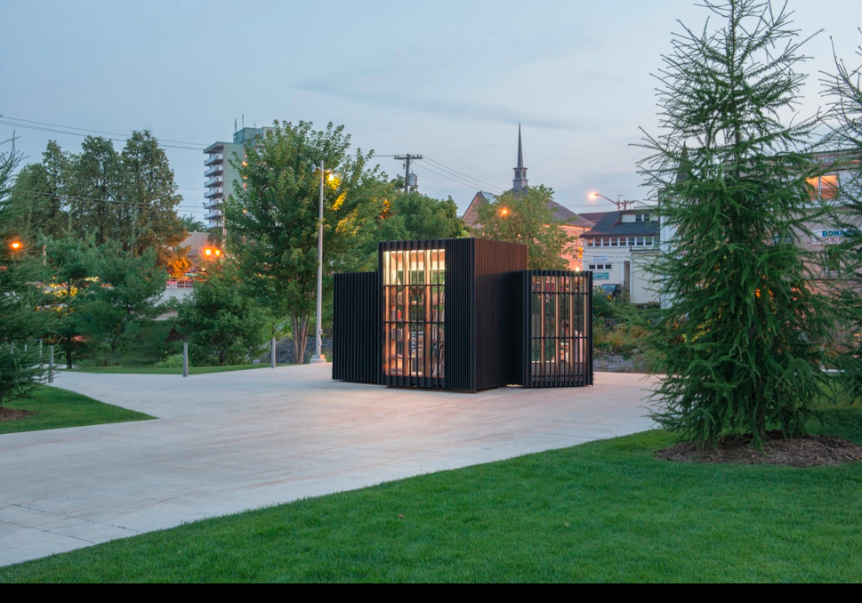
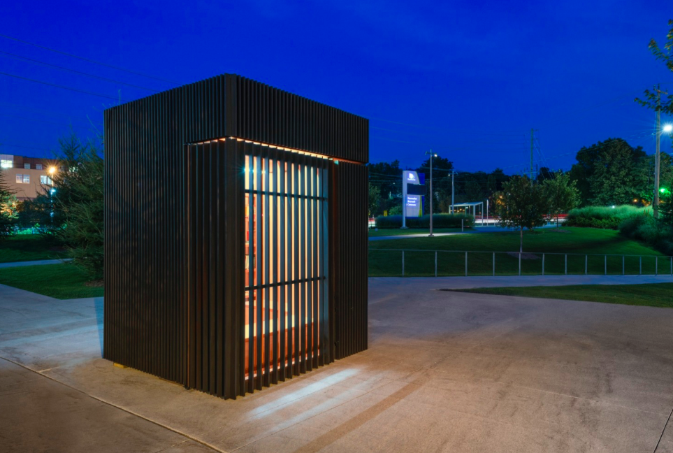
Story Pod by Atelier Kastelic Buffey
Photo Credit www.archdaily.com
The Story Pod is a community-supported lending library designed by Atelier Kastelic Buffey (AKB), it is helping to invigorate the Town of New Market. The pod, placed on the edge of a prominent, recently completed civic square, in the heart of the town’s historic district, continues the municipality’s plan to use contemporary design as a means of creating a lively, current-day hub for gathering within the leafy, quaint setting.
HAZE by C&C Design Co.
Credit http://www.archilovers.com
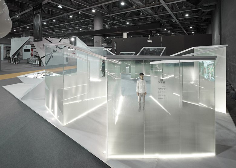
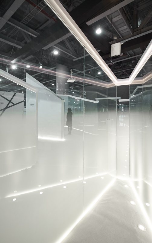
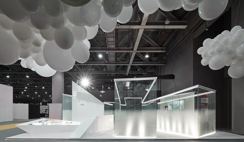
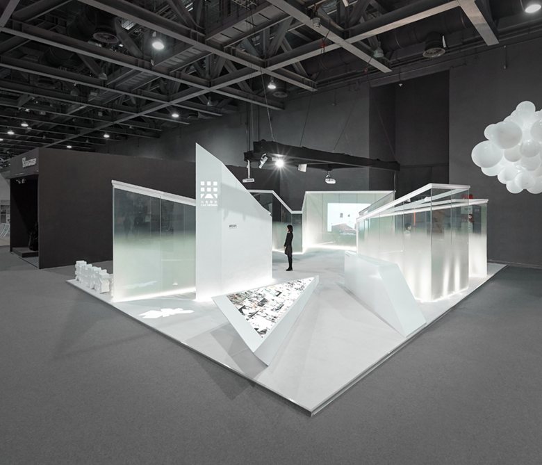
This is an interactive art installation which with several boxes to the heart connected each other. The white fog effect from gradient laminated glass makes people have the feeling of nothingness. In addition to the ecological sense of haze, it also hopes to express relations about people and virtual world, it is another kind of invisible "haze," which is also surrounded by e-commerce and virtual social, people indulge in it and ignored the daily life around themselves, even neglected irrigation to the reality life. The designers hope to arouse people’s reflection of this state when they are in the experience of this situation.
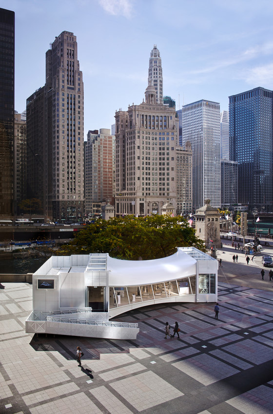
WithMe Chicago by Giorgio Borruso Design 2016 WINNER
Credit: https://www.architonic.com
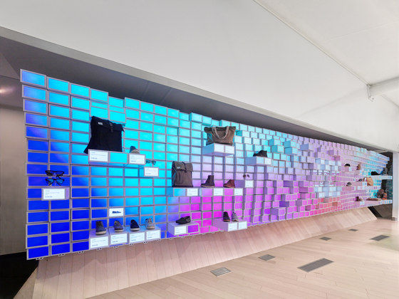
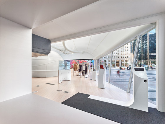
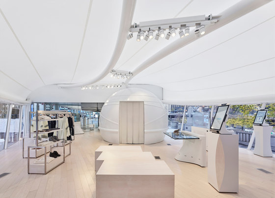
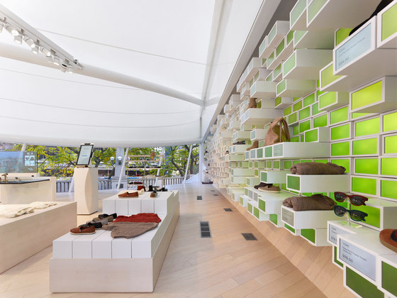
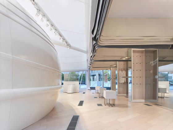
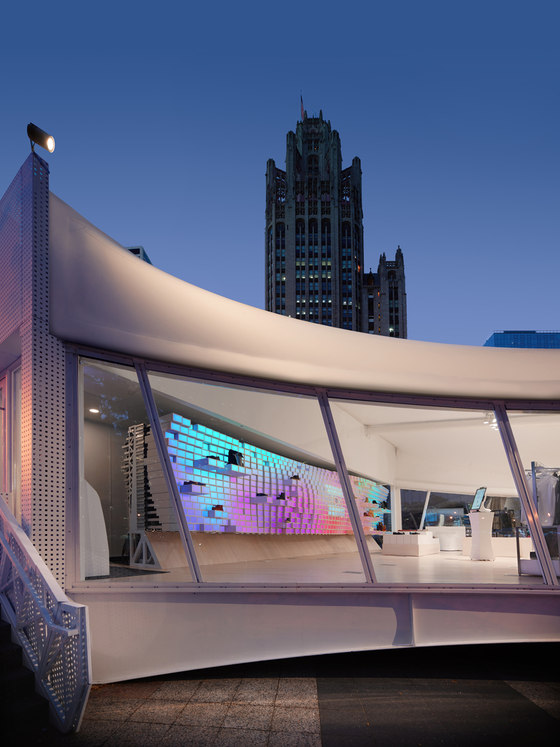
WithMe in Chicago is a 3,000 square foot mobile retail space designed. The mobile unit challenges traditional models of retail architecture by allowing innovative brands to inhabit a technologically advanced space for a brief period of time providing scalability, rapid deployment and testing of new ideas in any market.
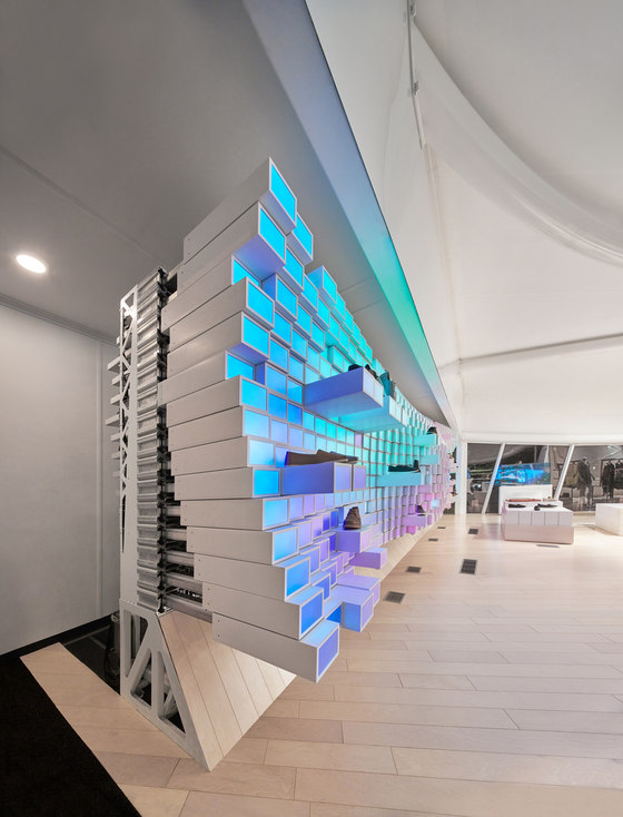
The interior is comprised of various interactive elements that blend online and physical experiences. Shapeshifter is a kinetic wall that exhibits a new way of thinking about spatial boundaries, adaptable reactive merchandise display, and personalized digital communication. Advanced fixtures like the ReacTable provide interactive product information by placing merchandise along the display surface, while telescopic fitting room enclosures blend ancient natural materials with the technological. Mirror displays and mirror-clad fitting room cabinets allow visitors to request and purchase products to try on in-store as well as browse online inventories for same day delivery. An Express Checkout Kiosk allows customers with the ShopWithMe app to swipe and pay on their way out. Read more
